Playful logo design for We Interact
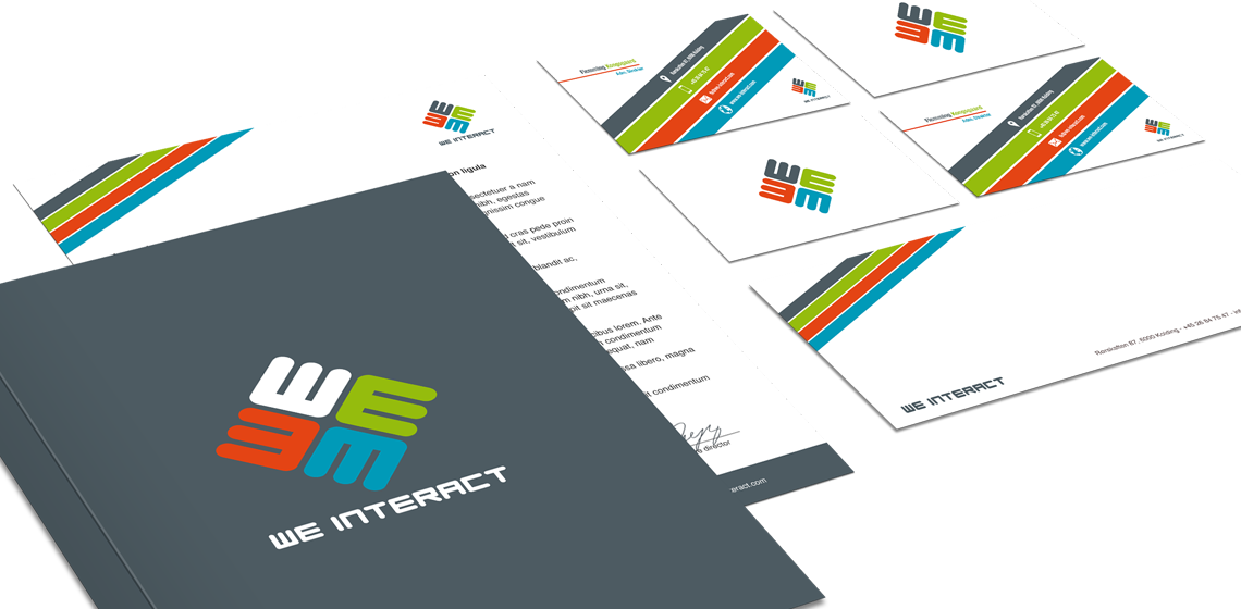
We Interact wanted a logo that expressed play and motivation.
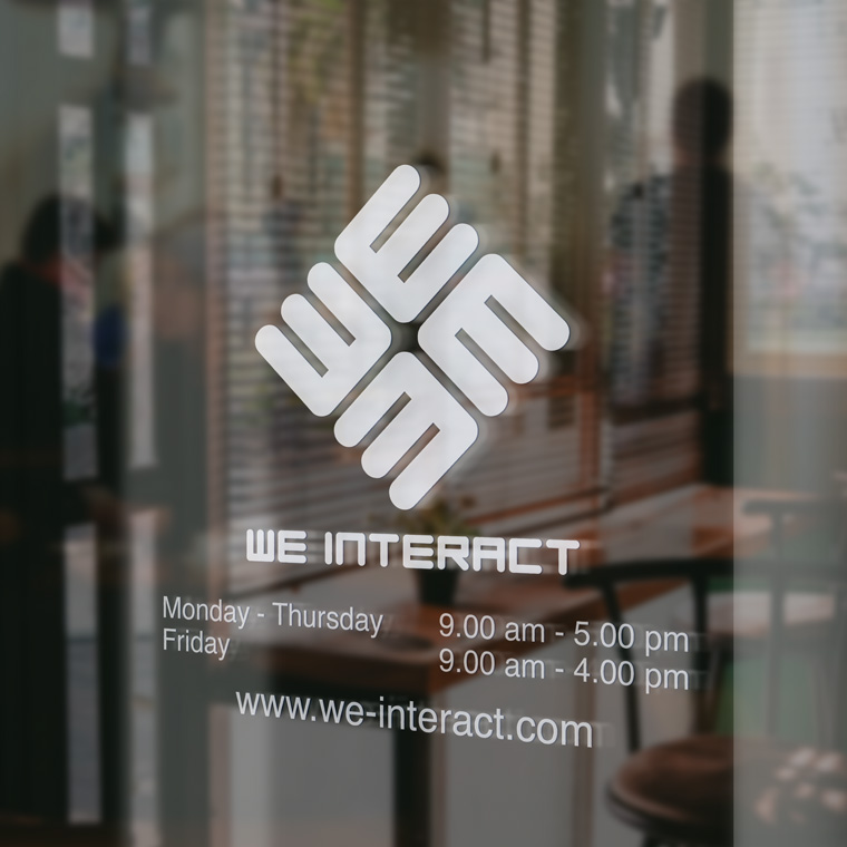
I designed this logo, where the identity lies in the figure playing the same shape to reproduce both a W and an E.
To get the right balance in all letters, I designed the basic form to be used.
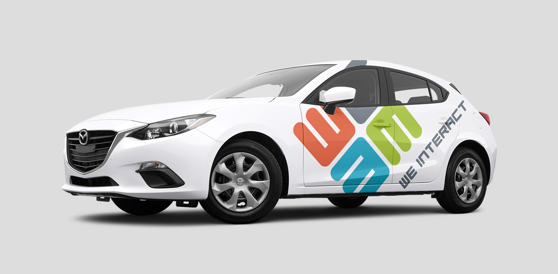
It ended with this design, which is very dynamic and at the same time is very symmetrical and well-balanced.
The figure is rotated 45 degrees, to create the impression of rotation, motion, dynamic and play.
The color scheme is set with fresh colors to underline the playful aspect.


